In today’s fast-paced digital world, attention is the ultimate currency. Marketers, educators, and communicators are constantly searching for ways to cut through the noise and deliver their messages effectively.
This is where infographics shine. These powerful visual tools transform complex data into easily digestible, engaging, and memorable content.
We are diving deep into the latest infographic statistics for 2025, exploring how these dynamic visuals are shaping content strategies, boosting engagement, and driving tangible results.
Whether you’re a seasoned marketer or just starting to explore the power of visual communication, this comprehensive guide will equip you with the knowledge to harness infographics for your benefit.
Why Infographics Dominate Digital Marketing in 2026
The numbers speak for themselves. Infographics are no longer just a trend; they are an essential component of any successful content strategy. They leverage our innate ability to process visuals much faster and more efficiently than plain text, making them incredibly effective at conveying information and grabbing attention.
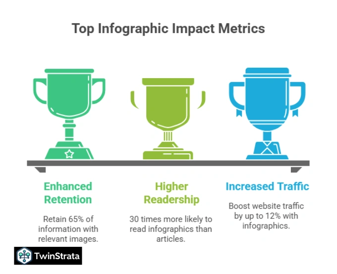
Key Takeaways on Infographic Relevance in 2025:
- Increased Traffic: Infographics can boost website traffic by an impressive up to 12%.
- Marketer Preference: Around 33% of marketers prioritize infographics as a visual element in their strategy.
- Higher Readership: People are an astonishing 30 times more likely to read an infographic than a traditional article.
- Enhanced Retention: We retain 65% of information when it is paired with a relevant image.
- Google’s Love for Visuals: Image results appear for 27.9% of Google searches, with nearly 3% of clicks on Google search results going to image blocks.
- Engagement Superstars: Posts featuring images and graphics see a colossal 650% higher engagement rate.
It’s clear: if you want to capture attention, inform effectively, and drive engagement, infographics are your go-to solution.
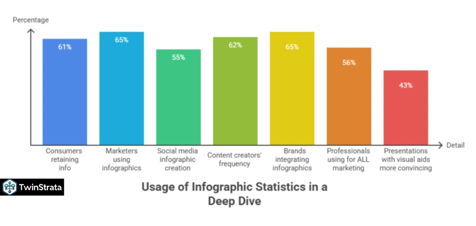
Infographic Usage Statistics for 2026: A Deep Dive
Marketers are increasingly integrating infographics into every facet of their content strategy. They understand that visuals are not just aesthetically pleasing but are vital for information retention and engagement.
How Marketers Are Using Infographics:
- Information Retention: A significant 61% of consumers find infographics the most effective way to help them retain information.
- Strategic Integration: An overwhelming 65% of marketers use infographics as a core part of their marketing and content strategy. This number rises to 65% of brands actively integrating them into their content marketing.
- Speed of Processing: Visual content is processed an incredible 60,000 times quicker than text, highlighting the efficiency of infographics.
- Social Media Dominance: 55% of marketers create social media infographics more often than any other visual media.
- Frequent Creation: A substantial 62% of content creators produce infographics twice a week.
- Top Social Platforms: Instagram and LinkedIn stand out as the top two social media platforms for infographic usage.
- Holistic Marketing Tool: 56% of professionals leverage infographics for ALL their marketing purposes, showcasing their versatility.
- Convincing Presentations: Presentations that incorporate visual aids like infographics are 43% more convincing.
- Color’s Impact: Using colored infographics can significantly boost a reader’s attention span and comprehension by 82%.
- Tooling Up: A sizable 39.7% of marketers in the United States utilize online tools to craft infographics and other visual content, demonstrating the accessibility of these tools.
- Valuable and Effective: A resounding 84% of companies consider infographic marketing a valuable and effective tool.
Table: Infographic Usage Trends 2025:
| Statistic | Detail |
| Consumers retaining info | 61% find infographics most effective |
| Marketers using infographics | 65% in marketing/content strategy |
| Visual content processing speed | 60,000 times faster than text |
| Social media infographic creation | 55% of marketers create most frequently |
| Content creators’ frequency | 62% make infographics twice weekly |
| Top social platforms for infographics | Instagram & LinkedIn |
| Brands integrating infographics | 65% in content marketing strategy |
| Professionals using for ALL marketing | 56% |
| Presentations with visual aids more convincing | 43% |
| Colored infographics boost attention/comprehension | 82% |
| US marketers using online tools | 39.7% |
| Companies believing in infographic value | 84% |
| Posts with images/graphics engagement rate | 650% higher |
Sources: Forbes
This data confirms that infographics are not just a nice-to-have but a critical element for engaging audiences and achieving marketing objectives in 2025.
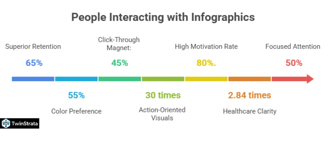
How People Interact with Infographics: Optimizing for Impact
Understanding how people engage with infographics is crucial for maximizing their effectiveness. This section illuminates user behavior, helping you design and distribute infographics for peak performance.
User Interaction Insights:
- Superior Retention: Readers retain 65% of the information when you pair it with a relevant infographic. Furthermore, infographics are responsible for an impressive 78% more information retention overall.
- Color Preference: A significant 55% of readers are more likely to accept a message presented in color rather than in black and white.
- Click-Through Magnet: Nearly half of online visitors (45%) are drawn to links featuring infographics, making them substantially more likely to click.
- Action-Oriented Visuals: Users are 30 times more likely to initiate a payment when prompted by visuals, underscoring their persuasive power.
- High Motivation Rate: Colored infographics boast a very high motivation rate of 80%.
- Healthcare Clarity: People receiving health data in infographic form are 2.84 times more likely to understand their condition better, highlighting their importance in complex fields.
- Focused Attention: 50% of users are more focused on content that includes images.
- Convincing Power: A study revealed that people are 43% more convinced when they see a graphical representation of any topic.
- Valuing Brevity & Detail: A strong 67% of users value visuals that are brief yet detailed more than text-only content.
- Brand Connection: 70% of users claim that content marketing campaigns featuring visuals help them feel more connected with the company.
- Faster Information Finding: People find information 70% faster in infographics, especially when they use color.
- Productivity Boost: Readers’ productivity increases by 15% if their instructions contain visuals.
- Reduced Error Margin: When visuals explain a task, the margin of error decreases by 80%.
Table: Infographic Interaction & Effectiveness
| Statistic | Detail |
| Reader information retention | 65% with infographics; 78% overall |
| Acceptance of color messages | 55% of readers prefer color over B&W |
| Click likelihood on infographic links | 45% more likely |
| Payment initiation with visuals | 30 times more likely |
| Motivation rate with colored infographics | 80% |
| Health data understanding | 2.84 times more likely to understand with infographics |
| User focus on image content | 50% more focused |
| Convincing power of graphical representation | 43% more convinced |
| Value of brief, detailed visuals | 67% of users find more valuable than text |
| Feeling connected with companies | 70% of users through content marketing campaigns |
| Information finding speed | 70% faster, especially with color |
| Productivity increase with visual instructions | 15% |
| Error margin decrease with visual task explanation | 80% |
Sources: Infographic World
These interaction statistics underscore that well-designed infographics are not just seen; they are understood, acted upon, and remembered.
General Infographic Statistics: The Broader Impact
Beyond direct usage and interaction, infographics contribute to broader business goals, impacting everything from inbound links to budget allocation.
Overall Infographic Impact:
- Processing Speed: Infographics can be processed 60 times faster than plain text.
- Information Discovery: Businesses that employ infographics are 28% more likely to find the information they need.
- Budget Allocation: Over 10% of the budget in 65% of businesses is specifically dedicated to visual content.
- Consistent Quality Challenge: A notable 43% of marketers report that creating consistent, high-quality visual content is one of their biggest hurdles.
- First Link Clicks: Nearly 37% of people click on the first link when presented with infographics.
- Inbound Link Powerhouse: Incorporating infographics into blogs and articles can lead to a staggering 178% increase in inbound external links.
- Brand Recognition: Color in infographics can improve brand recognition by up to 80%.
- Sales Boost: Any material with colorful visuals, including infographics, can boost sales by up to 80%.
- Survey Participation: Colorful infographics and colors, in general, boost participation in surveys by up to 80%.
- Automation Desire: 37% of content marketers aim to automate various design types, including infographics, ebooks, and reports. 22% want to automate reformatting and resizing, 15% branding automation, and 14% team collaboration automation for visuals.
- Marketing Strategy Importance: 49% of marketers believe visuals are very important to their overall strategy, 22% find them quite important, and 19% consider their strategy nothing without them. No content marketer viewed them as unimportant.
These broader statistics highlight the strategic importance of infographics as a powerful, multi-faceted tool in the modern business landscape.
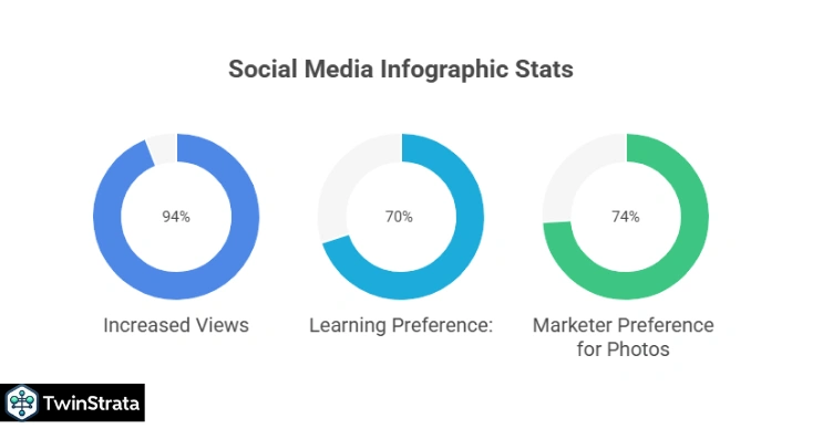
Social Media Infographic Stats: Sharing is Caring
Social media thrives on visuals, and infographics are perfectly suited for this environment. Their ability to convey complex information quickly makes them highly shareable and effective in reaching vast audiences.
Infographics on Social Media:
- Unrivaled Shareability: People like and share infographic content 3x more than any other content on social media platforms.
- Increased Views: This surge in shares results in a 94% increase in infographic views.
- Learning Preference: A significant 70% of social media users prefer to learn about a topic through infographics rather than text.
- Facebook Engagement: Facebook posts that include images have twice the engagement rate.
- Twitter Retweets: Tweets containing a visual are 150% more likely to be shared.
- Marketer Preference for Photos: 74% of marketers prioritize photos in their social media posts.
- Attention Span Solution: The popularity of infographics on social media is growing due to the decreasing attention span of users.
- Ideal Infographic Sizes for Social Media:
- Facebook: 1200 x 628 pixels (shared post), 1080 x 1920 pixels (stories, 1.91:1 aspect ratio).
- Instagram: 1080 x 1080 pixels (square), 1080 x 566 pixels (horizontal), 1080 x 1350 pixels (vertical), 1080 x 1920 pixels (stories).
- Pinterest: 600 x 900 pixels.
- LinkedIn: 1104 x 736 pixels.
- Snapchat: 1080 x 1920 pixels.
- Twitter: 1200 x 675 pixels (single image or GIF).
Social media is a visual battleground, and infographics are a formidable weapon, ensuring your message gets seen, shared, and remembered.
Types of Infographics: A Visual Toolkit
Infographics come in various forms, each suited for different communication objectives. Understanding these types allows you to choose the most effective visual narrative for your data.
The 9 Main Types of Infographics:
- Process Infographics: Illustrate the steps in a sequence or workflow.
- Statistical Infographics: Focus on presenting data, charts, and numbers.
- Informational Infographics: Provide a comprehensive overview of a topic.
- Timeline Infographics: Show events in chronological order.
- Geographic Infographics: Visualize data related to locations or regions.
- Comparison Infographics: Highlight similarities and differences between items.
- Hierarchical Infographics: Display levels of organization or relationships (e.g., pyramids, flowcharts).
- List Infographics: Present information in an easy-to-read list format.
- Resume Infographics: A creative way to showcase skills and experience.
By selecting the right type, you can ensure your infographic effectively communicates your specific message.
Responsive Infographic Statistics: The Mobile-First Imperative
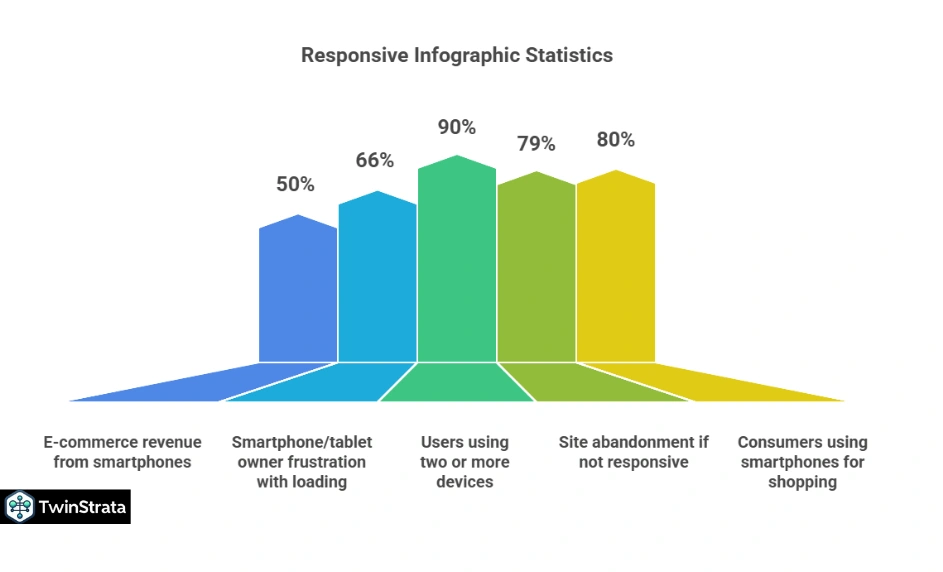
In an increasingly mobile-centric world, responsiveness is non-negotiable. Infographics must adapt seamlessly to various screen sizes to maintain their effectiveness and user engagement.
Why Responsive Infographics Are Crucial:
- Mobile Commerce Dominance: 50% of total e-commerce revenue originates from smartphones, aligning with global trends in mobile-first shopping.
- Marketer Adoption: Following a mobile-first approach when designing infographics has benefited the majority of marketers.
- User Frustration: A significant 66% of smartphone and tablet owners express frustration with slow page loading times from non-responsive designs.
- Screen Size Diversity: There are approximately 250 different screen sizes currently on the market.
- Vast Mobile User Base: There are over 6 billion smartphone users globally, and this number continues to climb.
- Multi-Device Usage: An impressive 90% of users use two or more devices simultaneously.
- Abandonment Rate: A critical 79% of people will leave a site if it isn’t responsive.
- Mobile Shopping Habits: 80% of consumers regularly use their smartphones for shopping.
Table: Responsive Infographic Importance
| Statistic | Detail |
| E-commerce revenue from smartphones | 50% of total |
| Marketer benefit from mobile-first design | Majority have benefited |
| Smartphone/tablet owner frustration with loading | 66% with non-responsive designs |
| Number of different screen sizes | Around 250 |
| Global smartphone users | Over 6 billion and increasing |
| Users using two or more devices simultaneously | 90% |
| Site abandonment if not responsive | 79% of people |
| Consumers using smartphones for shopping | 80% regularly |
Designing responsive infographics is no longer an option but a necessity to meet user expectations and capture the vast mobile audience.
Something New: What Users Are Asking on Quora and Reddit
Beyond the statistics, current conversations on platforms like Quora and Reddit reveal evolving user needs and challenges related to infographics. Many users are looking for practical tips to make their infographics stand out and address common pitfalls.
- “How do I make an infographic truly engaging and not just a bunch of stats?” Users want to move beyond basic data dumps. They seek storytelling elements, compelling narratives, and emotional connection within their infographics. The answer lies in combining strong visuals with a clear message and a human touch, focusing on what the data means to the audience.
- “What are the best free tools for creating professional-looking infographics?” Accessibility is key. While many marketers use professional software, the demand for user-friendly, free, or affordable tools that still deliver high-quality results is constant. Tools like Canva, Piktochart, and Venngage are frequently discussed for their ease of use.
- “How do I ensure my infographic is mobile-friendly and accessible to everyone?” This ties directly into responsive design. Users are asking for practical advice on font sizes, image optimization, color contrast for readability, and alt-text for accessibility, ensuring their infographics reach the widest possible audience.
- “Are there specific color palettes or design trends that increase infographic effectiveness?” The visual appeal is paramount. Users are looking for guidance on modern design trends, effective color psychology, and how to create a cohesive visual brand identity through their infographics.
- “How can I measure the ROI of my infographics beyond just shares and traffic?” Marketers want to quantify the impact. Discussions revolve around tracking conversion rates, lead generation, time spent on page, and how infographics contribute to overall business objectives, not just vanity metrics.
These insights from user communities highlight a move towards more sophisticated, accessible, and measurable infographic strategies.
FAQs About Infographics Statistics
1. Are infographics still relevant in 2025, considering the rise of video content?
Yes, infographics remain highly relevant in 2025. While video is popular, infographics excel at presenting complex data quickly and clearly. They’re perfect for visual summaries and appeal to users with limited time or shorter attention spans.
2. How do infographics help with SEO and website traffic?
Infographics boost SEO by earning backlinks and increasing engagement. Blogs with infographics see 178% more inbound links, and visual content appears in nearly 28% of Google searches. They also improve time on page—key for ranking higher in search results.
3. What makes an infographic effective and engaging?
A great infographic tells a data-driven story, uses clear visuals and concise text, and flows logically. Design should be both eye-catching and easy to follow, with mobile responsiveness and accessibility for wider reach.
4. What are the main benefits of using color in infographics?
Color enhances attention, comprehension, and retention—boosting understanding by 82% and message acceptance by 55%. It also strengthens branding and can increase user engagement and even sales by up to 80%.
5. How important is responsive design for infographics today?
Responsive design is essential. With billions using smartphones, infographics must display well across all devices. Poor mobile experiences cause high bounce rates, while responsive designs improve reach and user satisfaction.
Also Read:
- Amazon Statistics
- AI Recruitment Statistics
- Facebook Statistics
- Gmail Statistics
- WordPress Statistics
Conclusion:
As we’ve meticulously explored, the data unequivocally proves that infographics are a powerhouse for modern communication. They drive superior information retention, cultivate stronger engagement, and deliver measurable ROI across diverse platforms.
With a substantial 65% of marketers embedding them as a core pillar of their strategy, businesses leveraging infographics are experiencing a remarkable 178% surge in inbound links. Simultaneously, social media shares for this visual content are skyrocketing, reaching 3x higher than text-only alternatives.
The sheer numbers paint a compelling picture. Moreover, the critical importance of responsive design cannot be overstated, especially when 79% of users abandon non-responsive sites and 50% of global e-commerce revenue now originates from mobile devices.
The future of content is undeniably visual, and infographics stand at the forefront of this evolution. By embracing these dynamic tools and adhering to best practices in design and responsiveness, you can significantly elevate your content strategy, capture audience attention, and achieve your communication goals. It’s time to make infographics an indispensable part of your digital toolkit.